
Mantra is one of the color forecast themes for 2020, according to Sherwin-Williams, which is meant to channel joy and serenity while lessening the noise that constantly surrounds us.
Sherwin-Williams
Color forecasters feel we’re stressed out and need to channel more calm into our lives, which is what’s driving their color trend forecasts for 2020. Three paint companies revealed their color palettes for 2020 earlier this month. If you want to know what colors we’ll be seeing more of in the coming decade, we’ve got the scoop.
Sherwin-Williams revealed 45 hues in five palettes, all colors that are meant to bring joy, serenity and focus to the mind, body and spirit.
“We expect 2020 to be an empowering year of change that will focus on bringing your best self into the new decade,” says Sue Wadden, director of color marketing at Sherwin-Williams. “Homeowners and designers alike are seeking warmth—colors that feel human and natural. The colors in these five palettes, when invited into our spaces, pave the way for wellness and self-nurturance.”
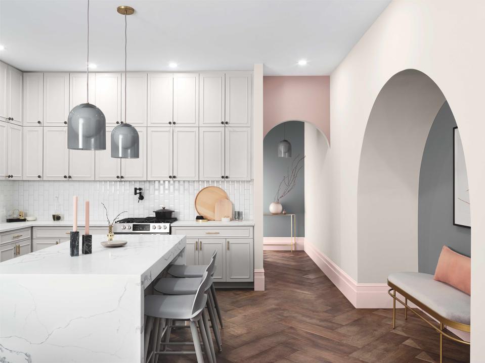
The Sherwin-Williams forecast includes a wide spectrum of blues, shades of terracotta, warm neutrals, pinks and deep greens.
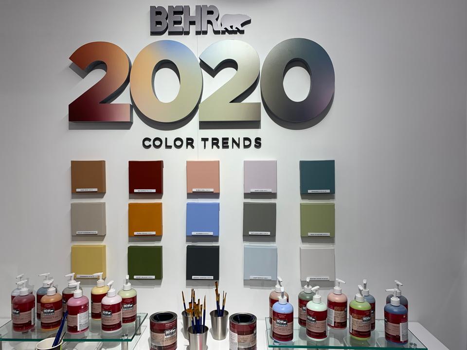
Behr also revealed its 2020 color trends which include 15 hues and three themes, one of which is called Restore.
Megy Karydes
Behr also revealed its 2020 color trends which include 15 hues and three themes, one of which is called Restore. Restore includes five colors meant to “surround people with serenity and provide restorative qualities for balance,” the company’s brochure shares. “The purposeful combination of blue and green tones speak to the senses by celebrating the sky and earth, offering a tranquil setting for a soothing experience.”
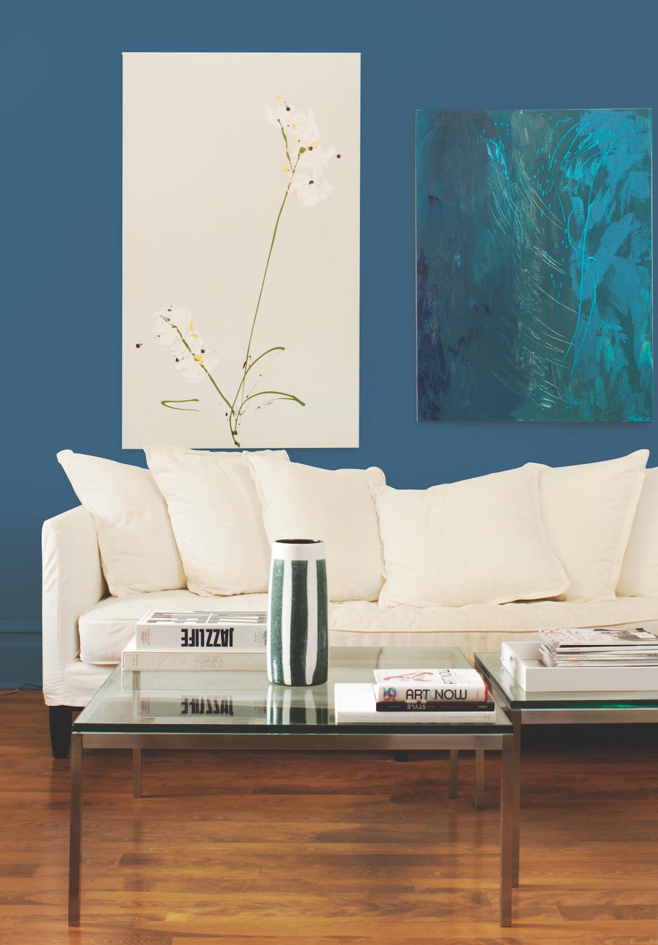
PPG paint brand’s 2020 Color of the Year is Chinese Porcelain, which the company says was chosen because it offers escapism in today’s technologically driven society.
PPG
PPG goes one step further and released its 2020 Color of the Year: Chinese Porcelain, a blend of cobalt, moody ink blue offers escapism in today’s data-driven society.
“The faster technology moves and the more convenience it offers, the more we seek activities, experiences and lifestyles that impart slowness and realness into our lives,” says Dee Schlotter, senior color manager, PPG paint brand. “The need for simplicity and escapism from technology is, in part, the reason that consumers are craving blues like Chinese Porcelain that bring us closer to natural elements such as the sea and sky – creating serenity in any space.”
Interestingly, almost everyone I’ve spoken to within the design space feel grey is on its way out. Color, they tell me, is coming back. We’re tired of the stark and simple grays and looking to use more color into our lives, whether those colors are soft pinks or jeweled blue tones.
The color trends released mid-year are usually a tease to the “Color of the Year” normally revealed in the fall. It allows designers and manufacturers to use them to create products or vision boards for their following year collections. It’s fun to see what forecasters are predicting and I, for one, am happy they’re recognizing the need to bring more serenity into our lives and how color can help make that happen.