
In times like these, dark, warm colors feel right.
getty
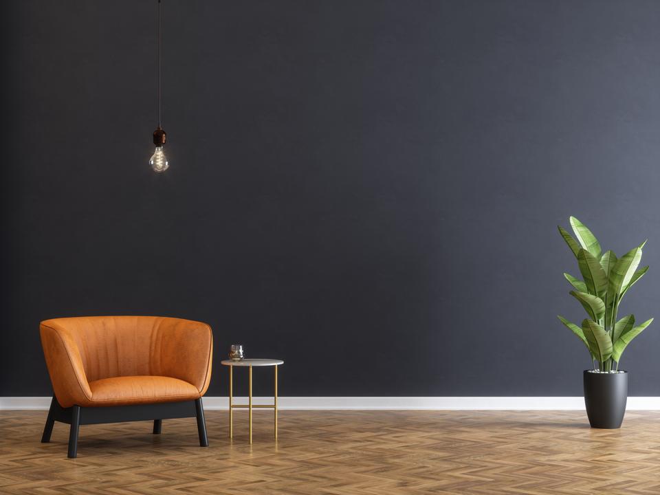
Last week Sherwin-Williams revealed its choice for the 2021 Color of the Year: a saturated, dark shade of earthy brown mixed with gray and a hint of dark green. Called “Urbane Bronze,” the color billed as a neutral is darker, moodier and less lighthearted than past choices. That is perhaps fitting for these serious, uncertain times.
“Tap into nature with a hue whose warmth and comfort breathe down-to-earth tranquility,” is how Sherwin-Williams SHW sells Urbane Bronze.
“Trend wise, subdued colors seem appropriate,” says Sarah Kennedy, Interior Design Director of CLB, an architecture and design firm located in Jackson, Wyoming, with new satellite offices recently opened in Bozeman.
“Our aesthetic is inspired by our natural surroundings, and we use neutrals very much in our design practice,” she says. “They offset natural hues like those of different kinds of wood; this is a color you would see in nature.”
“The trend for biophilia continues to shape our spaces, proving that nature is never far away,” Sherwin-Williams stated in a press release. “Urbane Bronze might be a color rooted in nature, but it also has a unique ability to ground a room through organic appeal. Whether it’s accentuating window trims or accent walls, this warm hue draws from nature for a feeling of relaxation and serenity. It also works well with other biophilic elements including, light-filled spaces and foliage.”
“We don’t only take in color through our eyes – we perceive it through our skin, and even when sleeping,” says Gala Magriñá, whose eponymous design firm is located in Long Island City, New York. Working in both residential and commercial interiors, Magriñá specializes in what she calls “holistic interior design,” which is concerned with the energy of a particular space and with the natural elements that surround it.
“Our design choices should be intentional because they affect us deeply,” she says. “Soft colors soothe and calm us, while darker colors, like Urbane Bronze, make us go inward. That’s one reason why this is such an appropriate color choice for this time. It is a complex color, powerful, serene, bold and grounding.”
Both Magriñá and Kennedy see the color as versatile in both interior and exterior applications.
“I would use it anywhere,” Kennedy says. “It’s a great base color and partners beautifully with green-based whites or with grays.”
“A soft blush or a terra cotta pairs well with this color,” says Magriñá. “For people intimidated by strong or bold colors, I would use Urbane Bronze on a focal wall: you would not tire of that.
“In fact,” she adds, “if you are afraid of color, start small. Painting a ten by ten wall is a Saturday afternoon project, and by painting that wall and hanging some art, you transform the room.”