
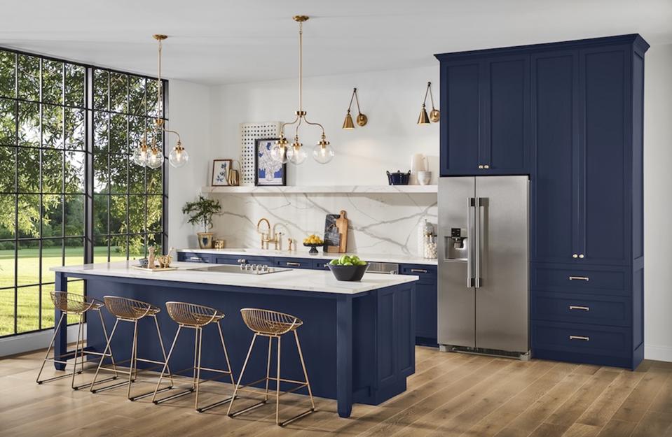
Sherwin-Williams sees this Navy color as an important new one for 2020.
Photo courtesy of Sherwin-Williams
Every few years the color esthetic for the home seems to change. For the last several years white and gray were everywhere in homes. But if the paint companies have anything to say about it – there are several new colors they see as being the new neutrals and the other most popular colors for the walls in homes.
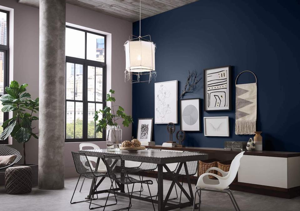
An example of a feature wall in the navy color predicted as a key color for the new year by … [+]
Photo courtesy of Sherwin-Williams
Benjamin Moore sees pink as the new neutral and color of the year – First Light 2102-70 . They point out that many holiday decorations this past year were pink and they claim it represents the shift in the way people are living and thinking of the home over the last decade.
Historically pink has been a decidedly feminine color. However as Benjamin Moore looks ahead to 2020 color trends that will shape the next decade, they see pink quickly evolving and shifting, becoming the new neutral to watch. One look at some of the world’s most prestigious restaurants, coffee shops, hotels and runway trends for both men and women reveal pink is indeed here to stay.
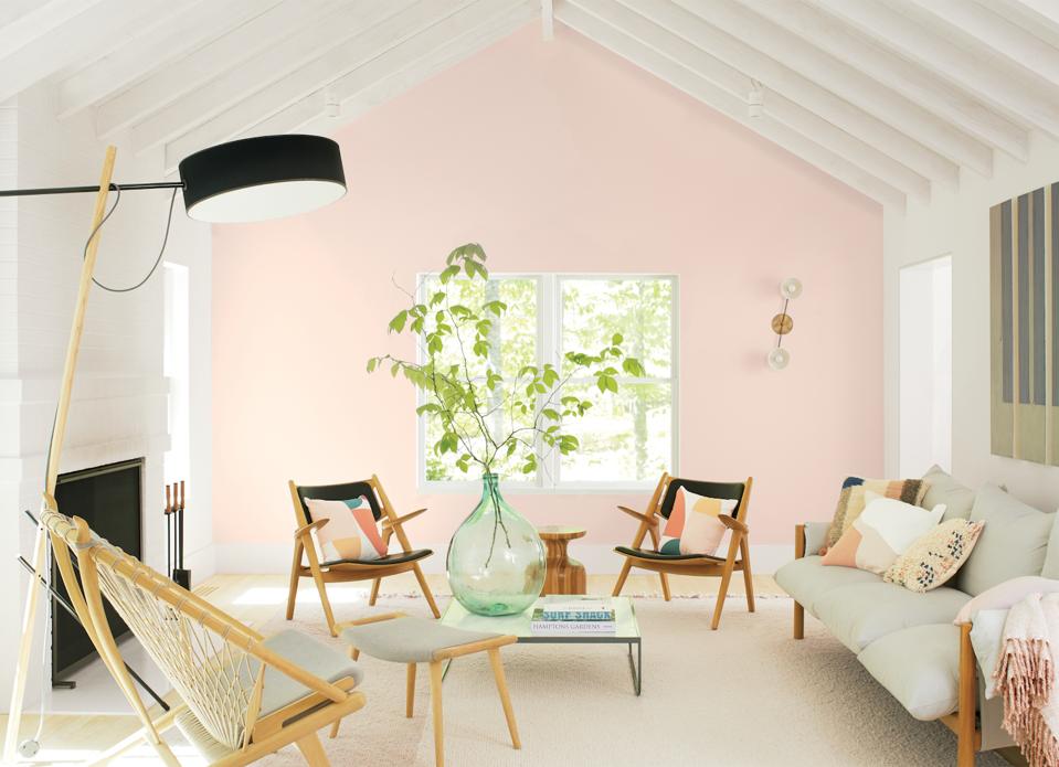
The living room accent wall is pink, which Benjamin Moore claims to be the new neutral.
Photo courtesy of Benjamin Moore
HGTV HOME® by Sherwin-Williams also chose a shade of pink – Romance – as their color of the year for 2020. They say this posh blush pink “…captures the balance of optimism and calmness we desire at home. The colorful neutral, with a touch of apricot, creates the perfect backdrop to glam accessories and artwork for maturity and sophistication.”
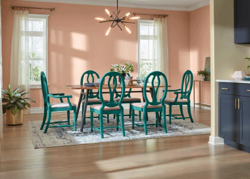
This is HGTV’s Romance color – their color of the year.
Photo courtesy of HGTV
Pantone’s color of the new year for 2020 is Classic Blue (19-40520). Their rationale is that the color instills “calm, confidence, and connection, …… highlights our desire for a dependable and stable foundation for this new era.”
Color Tempered Sage was used in this Burbank, CA kitchen.
Photo courtesy of Valspar
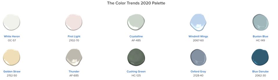
Valspar has a group of 12 colors they forecast as the colors for 2020. These colors are nature-inspired to bring serenity into the home. “Earth’s prescription for the chaotic, busy lives we all live is to bring the tranquility of nature and the outdoor world into the home. That’s exactly what we set out to accomplish when forecasting the 2020 Colors of the Year,” says Sue Kim, Valspar Color Marketing Manager at Sherwin-Williams.
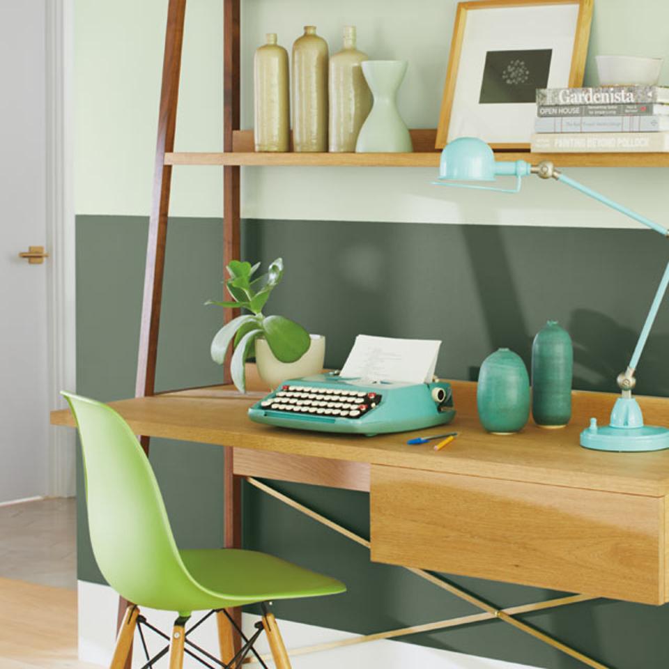
Some of the colors Benjamin Moore predicts for the home in 2020.
Photo courtesy of Benjamin Moore
Sue Wadden, director of color marketing for Sherwin-Williams sees deeper, moodier colors becoming more and more popular in 2020. Bold blues and greens, she says, will top the list of important hues. The color experts at Sherwin-Williams spend months researching rising trends in color, design, fashion and pop culture across the world. From that research, they found people are interested in wellness as a counterpoint to a hectic world, and therefore leaning into design that makes them feel well. Wadden claims that, “After a decade filled with white and gray everywhere, homeowners are looking toward nature-inspired blues and greens that can create a sense of serenity and a “retreat” at home.” They selected Naval SW 6244 as their 2020 Color of the Year because this deep navy hue is rooted in the seas and skies, which brings people closer to wellness within our own homes.
Wadden also sees more colors connected to traditional color palettes, with a return to beige and brown, but used in new and unique ways, like monochrome across a room’s features. And, for those who’d like to experiment with color but prefer not to paint an entire room, she sees geometric, colorful designs that emulate the feel of artwork.
Here are two of the colors from the Benjamin Moore colors predicted for 2020.
Photo courtesy of Benjamin Moore
Asked how the paint companys’ choices in color influences homebuyers, Wadden responded that providing a color of the year provides inspiration for homeowners and designers. With so many color options available selecting ones for any project can be overwhelming. She says that their color choices help take the guesswork out of the process and provide great options that could work for anyone. “It’s a great way to get people talking about the future of design and the possibilities around color.”
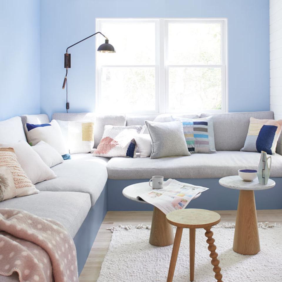
A shade of blue recommended by Benjamin Moore.
Photo courtesy of Benjamin Moore
The color consultants at Paintzen offer several tips regarding choosing paint. They recommend painting an accent wall “with dark colors without committing to a full room – a fun way to be part of the Color of the Year trend without feeling the need to repaint every surface in a room.” They also recommend creating balance with lighter colored decor and furnishings when using darker colors and adding mirrors to help make a room feel bigger. Some of their favorite places to add fun colors are front doors and kitchen cabinets. They suggest using cooler light bulbs to additionally expand the space. When choosing between cool or warm lighting, “always keep in mind that cooler bulbs are brighter and have a more modern feel, which tricks the eye into thinking the room is bigger than it is.”
According to Kristen Chuber, Certified Color Consultant at Paintzen, “The environment plays a role, especially in the last few years. As our population spends more time indoors, on our computers, tablets, and mobile devices, than out in the world; it seems people are looking to reach out and experience nature again. Biophilic design, the idea of bringing that feeling of nature indoors, has likely played a role in guiding the Color of the Year selection in recent years.“ The team at Paintzen offers color consultations to all customers free of charge to help get them started on their color selections.